The Data Explorer is an online tool for science communication and citizen science developed by our ParCos researcher, Natasha Tylosky, during her research at LUT University. The idea behind the data explorer is to provide a platform that encourages users to connect different datasets between various fields.
Project Overview
Scientific data is not always accessible to a wide public. Even if data is open source, it can be difficult for people to access it. This is particularly the case when they lack a scientific or technical background. What’s more, non-scientists rarely get the opportunity to contribute to data that may be important to them or even directly related to them. When researchers are outsiders working with local communities, data accessibility and inclusivity are especially important.
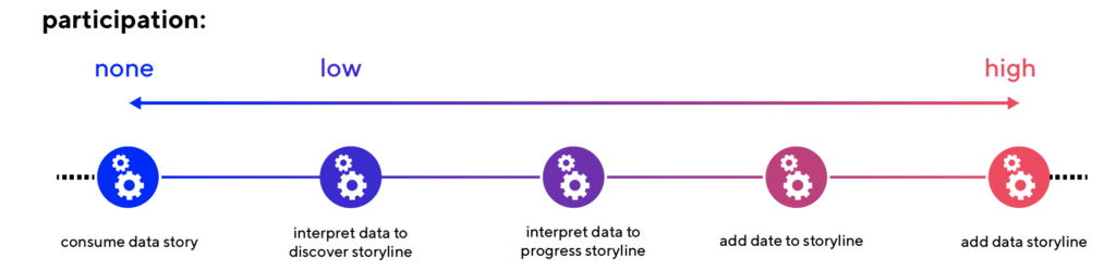
Our researcher’s solution to this was to build the Data Explorer. This tool serves researchers in their pursuit to include non-experts in the research process. By introducing a novel way to combine and visualise various datasets chosen by scientific experts, the Data Explorer enables laypersons to interact with and curate different data sources and encourages them to add their own data stories to this interactive space.
What is the Data Explorer?
The Data Explorer is an online tool that allows the public to view and explore scientific datasets related to a particular topic. All of these datasets have been curated by a group of researchers. In the current prototype of the Data Explorer, all the datasets are related to biodiversity in Helsinki. Here, users can first familiarise themselves with these different datasets by viewing short, summarizing data comics. These comics illustrate the information that is present in a specific source. Secondly, they can click on a link to the actual dataset. This enables them to easily explore that dataset further by themselves. Finally, users can create and upload their own stories about the datasets in The Data Explorer. In so doing, they can bring their perspectives of the datasets into this interactive space.
For example, if you notice that the populations of both squirrels and bats are rising, you can write a story about why you think that is happening. Maybe there are more green spaces in Helsinki? Or maybe there is less pollution? It’s up to you to find out!
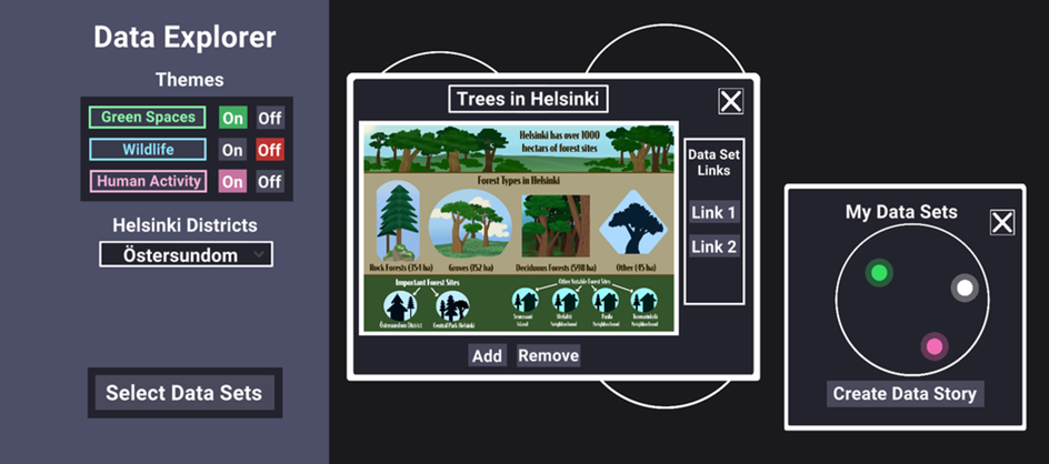
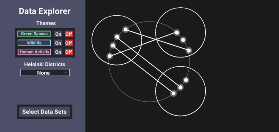
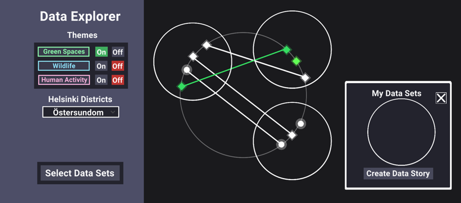
The Data Explorer uses a ‘constellation’ layout. A constellation in The Data Explorer centres around a general topic, in our prototype that topic is biodiversity in Helsinki. Likewise, each white point or ‘star’ represents a dataset, and every white circle represents a data story. Lines that connect different stars show if different data stories share a dataset. It is, moreover, possible to sort datasets by theme and location: stars that relate to a selected theme share the same colour, while stars relating to a selected location turn into a diamond.
Try out the public prototype of the Data Explorer yourself!
What makes this data visualization layout unique information-wise, is that it is possible to scale this constellation visualization in or out, to the micro or macro level, to display different related datasets. In future versions of the Data Explorer, different constellations could potentially centre around different connected topics. This way, the Data Explorer can serve to show relationships between diverse data types, even if they don’t have an immediate apparent connection. Put differently, it can help users identify new connections between different selected topics.
Future Evaluation & Iterations
The current version of the Data Explorer will be tested by a much wider audience. This test will include a control group, and there will be future releases of the Data Explorer as Natasha progresses with her research. The next goal of this project is to conduct an ‘in the wild’ study. A future version will thus be tested in a setting like a classroom or community centre.
Source
Tylosky Natasha. (2021). Parcos Data Explorer, Deliverable 6.2. of the Horizon 2020 project ParCos, EC grant agreement no 872500, Lappeenranta, Finland.