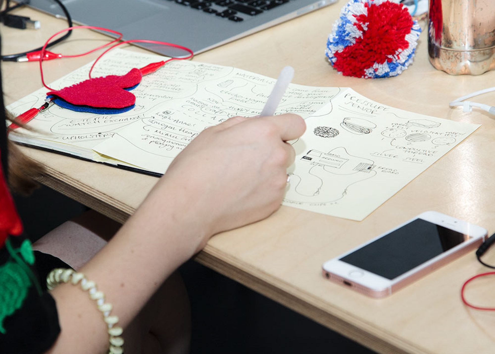
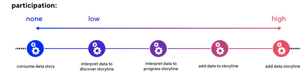
From September 2021 till January 2022, 17 students of Media and Information Design (LUCA School of Arts, campus Brussels, Belgium) created a wide range of participatory data stories on the topic of climate change. These third year Bachelor students were already trained at designing data visualisations, from creating non-fictional stories to shaping interaction design. For this assignment, they were asked to bring their design skills together. The process was guided by the ParCos Storyteller: a ParCos tool for guiding participation in data storytelling. Students were introduced to existing data stories that ranged from inviting the audience to interpret data and discover storyline(s) (see Figure 1 below, left), to participating in the story by contributing data, or even adding their own data story(line) (see Figure 1, right).
The challenge
The topic of climate change was chosen because of its relevance to a wide audience, and in particular youngsters. The target audience for this assignment can be more exposed to environmental pollution and susceptible to its damaging health effects, while youngsters usually have a smaller contribution to environmental pressure and less possibilities to protect themselves. To mitigate these inequalities, participatory data stories can provide a stepping stone to engage themselves with the issue through data, enabling them to raise their voice.
Climate change is a huge and multi-faceted issue, and the students were left free to explore any journalistic angle for a story, as well as a fitting medium. Results ranged from interactive websites to installations, physical books, and card games.
The Participatory Data Stories
0. Consume data story
For a story to be participatory, it should at least allow for (inter-)activity. For example, consumers of the story should be able to easily retrieve a data source to further discover information or check the trustworthiness of the source.
At this level, none of such links are provided. Stories are created to be consumed without any active participation of viewer, reader or listener. Examples in this level are explainer videos or non-interactive graphs.
We present this category to demonstrate how it differentiates from the other levels. However, students did not create any examples of this (as the assignment explicitly requested triggering some kind of active participation by the target audience).
1. Interpret data to discover storyline
Typically, examples of data visualisation in an online journalistic context allow for some kind of interactivity, such as by filtering categories or zooming in and out. This activity allows for the news consumer to be involved in the interpretation, although it might be very limited.
Student Mattia Gentile explored the well-established journalistic scrollytelling format, in which the viewer is free to skip through text, images and graphs to learn about the topic of hybrid teleworking or schooling and how it affects the environment.
Students also explored less typical media formats. Here, two projects were presented: a data story card game and a data story object.
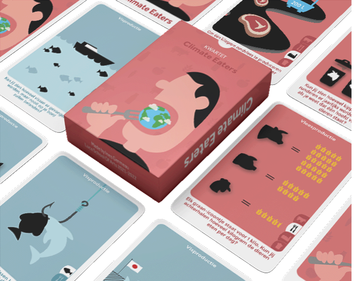
Student Ines Germeau designed a quartet card game on the impact of food production on climate change. This game focuses on children between 8-12 years old. In each of the quartets, she highlights one particular food group, such as meat, fish, wheats and vegetables. Children can puzzle data on the climate impact together and construct a coherent data story. This way, children are actively interpreting the data at hand.
Data story objects are a way to bring data stories in a surprising way to an audience. With the project of student Maureen Durviaux, we are invited to construct a chair as if it were a story. In the furniture’s pieces, different data graphs on the impact of furniture waste on the climate are hidden. The audience is thus invited to construct the data story together with the actual object; the chair.
2. Interpret data to progress storyline
While the first level cluster of stories facilitate viewers to interpret data as a way to reveal the story, this second level beholds a factor of surprise. Here, data interpretation may also lead to additional data or additional story viewpoints.
The project of student Simon Nelissen departs from an interactive data story on the impact of shell-picking at the beach on the environment. Viewers can scroll through this story via a mobile website and explore underlying data and information sources. The story is complemented with an intervention on the beach. The student spread hundreds of bright blue seashells that visitors on the beach could encounter and that link to a mobile story. This way, visitors are not only invited to interpret the data sources, they are also invited to provide their geo-data on where and when it was found, which, all together, adds a new storyline to the existing story.
3. Add data to storyline
On this level, story consumers are also invited to consciously contribute data to the data story.
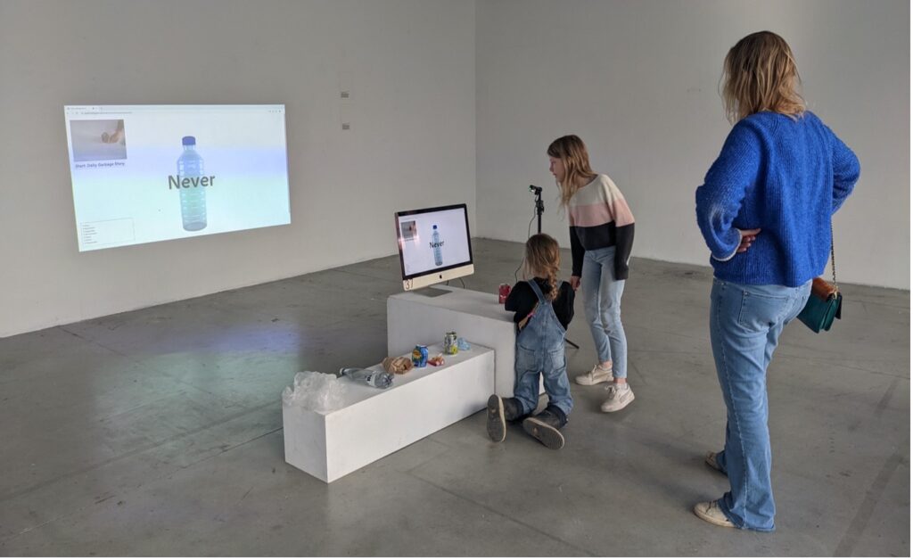
Student Sam Evers designed the Litter Calculator, which is an urban intervention that encourages passers-by to pick up litter that surrounds the installation and learn how long it takes to break down the material of the litter. For example, plastic will never break off while paper would take a couple of months. The student used Machine Learning to develop the intervention. She also programmed the installation to capture and log all of the incoming litter. This way, a data story of local litter is generated.
4. Add data storyline
Finally, ultimate participation is achieved when viewers contribute their own data story.
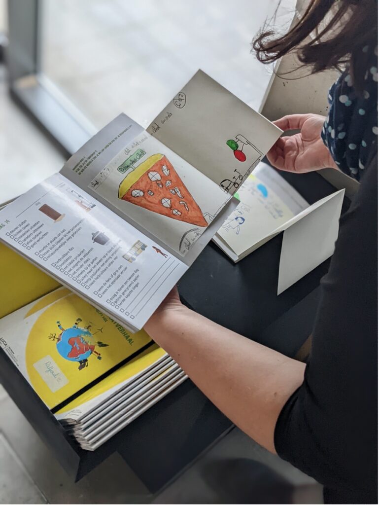
Student Elise Reuschel created a booklet for children of 10-12 years old. This book shares a data story on how their behaviour at home impacts climate change, and how they can contribute by behaving differently. The book also allows children to keep track of their behaviour by manually logging different personal data points, such as whether they switch off the lights or not. Children are also invited to reflect on the data story through drawing and coming up with solutions.
Other projects in the first level (data interpretation to discover storyline) include:
Exploding Earth (Maarten Vandevelde)
“Because climate change is a complex topic, I created a card game to stimulate conversation. The game is based on an already existing game called: ‘exploding kittens’. While the concept stayed the same, the content got redesigned to fit within the theme of climate change. Cards can represent climate disasters, remedies against climate change, activism or even some of nature’s most beautiful treasures.”
F1 (Warre Kempeneers)
“This data story is focused on one of the biggest polluters of the world: transport. My target audience is a younger audience: the youth. Because climate change is everywhere and is talked about all the time, some people are getting sick of the talks (definitely the younger generation, whose main focus is not climate change). I wanted my story to be a little more subtle. In addition to the younger target group I focused on those that use the car unnecessarily a lot; car enthusiasts , race fans, … With a data story on motorsport I wanted to show that the big guys are also thinking about the climate. To make it more subtle, I thought of a toy car that you could decorate with stickers and colours of companies that make a change in motorsport by focusing on climate change. The stickers are advent-like hidden under pieces of information on a poster so the designers first needs to look at the information and then reveal the stickers. All of this can be done at home.”
Algae (Mihriban Eryoruk)
“My project would consist of a transparant biotope, where algae and other plants live in. The biotope will consist also of a CO2 meter so people can see how high or low the CO2 is in the biotope. Obviously the lid on the biotope can be opened, which will ensure that CO2 can get in and out, and help determine the meter.”
Rainfall through time (Irene Haegeman)
““Rainfall through time” is a physical installation that uses the precipitation amounts (NL: neerslaghoeveelheden) of Belgium. By turning the knob and pushing buttons, the visitor is invited to respectively change the year and season of the data. By changing the data, the flow of water that comes out of the faucet changes. This way, the user sees how much really fell out of the sky (or in this case, the faucet).”